If you ask a room full of interior designers about “beige and oak,” you might expect a collective sigh of fatigue.
Or at least, that’s what a lot of design enthusiasts think is happening right now. If you look at design feeds or walk through the newest luxury developments in Palm Jumeirah, Emirates Hills, or Dubai Hills, it seems like the entire city has been dipped in oatmeal and fitted with light wood.
It’s easy to dismiss this as just another passing Instagram trend—a commercialized version of “Quiet Luxury” or “Japandi” minimalism. But at JEA, we are here to tell you that beige and oak aren’t going anywhere. In fact, they still reign supreme in Dubai’s luxury interiors for reasons that go far deeper than aesthetics.
Why is Beige and Oak Popular in Dubai Interior Design?
**** Beige and oak reign supreme in Dubai’s luxury interiors due to a combination of climate and the rise of the quiet luxury movement. Warm neutrals absorb and soften the intense, bright desert sunlight—unlike clinical white or grey—while natural oak and travertine provide a tactile, grounding sensory reset from the city’s fast-paced urban lifestyle.
The Science of Light: Why Neutrals Work in the Desert
Let’s talk about something that doesn’t get discussed enough: the physics of light.
Dubai has a very specific, intense quality of sunlight. It is bright, sharp, and blazing for most of the year. Under this kind of light, design decisions behave differently than they would in London, Mumbai, or New York.
The Stark White Trap: If you paint a Dubai villa in stark, clinical white, the intense sun turns the room into a giant reflector. It hurts your eyes, feels sterile, and ends up looking like a doctor’s clinic.
The Cold Grey Problem: Cool greys, which were popular for a decade, feel incredibly gloomy and flat under Middle Eastern sunlight. They don’t bring joy; they just feel dusty.
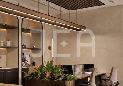
The Warm Neutral Solution: Warm neutrals—sand, bone, oatmeal, soft taupe, and light greige—absorb the harshness of the sun. They soften the light, reflecting a warm, golden glow back into the room. It makes the interior feel instantly cooler, softer, and more like a sanctuary.
When you pair these tones with the organic warmth of natural oak, you are effectively bringing the cooling logic of a desert oasis indoors.
The Danger of “Boring Beige” (And How JEA Avoids It)
Here is the candid truth: it is incredibly easy to do beige and oak badly.
If you paint your walls beige, buy a beige fabric sofa, put down a flat beige rug, and install generic oak-veneered doors, the room will fall asleep. It won’t look like quiet luxury; it will look like a corporate office waiting room.
“Beige doesn’t have to mean boring,” says Sarah Sham, Co-founder and Principal Designer at JEA. “When you strip away bold color, you have to work twice as hard on texture. If you have flat plaster next to a flat sofa, the space dies. But if you layer a raw linen drape against a hand-applied lime plaster wall, next to a fluted oak panel and a rough-cut travertine table—that’s when the room starts to sing. You don’t need color when you have depth.”
To make a neutral palette feel expensive and alive, you must follow the rule of tactile contrast.
Flat Surfaces (Plaster, Paint)
+ Textured Fabrics (Bouclé, Raw Linen, Shearling)
+ Organic Stones (Travertine, Honed Limestone)
+ Structured Wood (Fluted Oak, Smoked Walnut)
= A Rich, Layered Luxury Interior
The Execution Reality: Nowhere to Hide
From an execution standpoint, designing a neutral, minimalist space is actually much harder than designing a colorful, maximalist one.
In a room filled with bold wallpapers, heavy patterns, and bright colors, your eye is constantly moving. The design can hide minor execution flaws. But in a beige-and-oak villa, there is absolutely nowhere to hide.
“Minimalism requires absolute perfection in construction,” explains Indu Govindan, Co-founder and Director of JEA. “Every single joinery line where the oak meets the wall, every vein-match on a travertine slab, and every recessed ceiling channel has to be executed to the millimeter. If a door frame is slightly off, or if the grain of the wood doesn’t align, it ruin the entire feeling of luxury. That’s why our Abra contracting team spends weeks detailing the micro-connections before we even touch a site.”
JEA’s 4 Rules for Elevating Beige and Oak
If you are planning to use a neutral palette in your home, here is how we ensure it looks premium, customized, and character-rich:
1. The 3000K Lighting Rule
Never use harsh, cool downlights. We rely heavily on warm, indirect lighting (specifically 2700K to 3000K LEDs) concealed within joinery, behind mirrors, and inside wainscoting. This creates soft shadows that highlight the textures of the wood and stone rather than flooding the room.
2. Introduce “Visual Weight”
A neutral room needs anchors so it doesn’t feel like it’s floating away. We always introduce small elements of deep, grounding colors. Think of a smoked oak detail, a basalt stone accent, a charcoal metal frame, or a dark walnut coffee table to slice through the beige.
3. Embrace the Flaw
Natural materials should look natural. We prefer honed limestone over polished marble, and brushed, open-pore oak over high-gloss lacquered finishes. The texture and minor imperfections of the natural grain are where the luxury lies.
4. Biophilic Accents
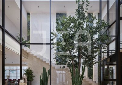
Green is a neutral. Introducing a mature, sculptural indoor plant—like an olive tree or a large fiddle-leaf fig – brings a neutral room to life. The organic shape of the branches breaks up the straight lines of modern architecture.
Beige and oak aren’t a cop-out; they are a classic. When done with intention, deep texture, and flawless execution, they create the ultimate luxury: a home that feels like a deep breath.
FAQs: Quiet Luxury & Warm Neutrals
1. Isn’t Japandi design going to go out of style soon?
The label “Japandi” might change, but the core principles of warm minimalism, organic materials, and functional layouts are timeless. Humans have designed spaces this way for centuries because it meets our fundamental need for peace and order.
2. How do I keep a beige-and-oak home kid-friendly and dog-friendly?
This is all about material technology. We use performance fabrics (like stain-resistant crypton or bouclés) and apply nano-coatings to stones. Natural matte oak is actually very forgiving with scratches compared to dark, polished surfaces.
3. What is the best wood species to pair with beige walls?
Natural European white oak, white ash, and light walnut are excellent choices. The key is to keep the finish matte or brushed to let the natural grain and texture stand out.